
YOUCARING
Design navigation for users who want to manage their online fundraiser.
PRIMARY GOAL
Design an intuitive navigation for users with one or more fundraisers that clearly directs to global, user (profile) and fundraiser level pages.
MY ROLE
Lead product designer from initial research and ideation to prototyping and the final delivery of hi-fidelity assets and specifications to engineering.
CONSTRAINTS
Must adapt to any screen size.


Who is the user? What matters to this person? How does this feature fit into their lives?
"It's been a difficult road, but one with many blessings along the way."
Hi, I’m Elizabeth and my husband's name is Taylor. We adopted our little Oliver 2 years ago from Uganda, and we're ready to bring another baby into our family. Before we adopted Ollie, I was diagnosed with PCOS in my early 20s and knew I would never be able to conceive children of my own. Taylor and I always knew we wanted to adopt, and after we got married, we started the process right away. It's not an easy road; the process is very long, expensive and there are no promises. We've come to learn this through our first adoption of Ollie, but it doesn't scare us to begin the process again.
So many of our friends, family and members of our community have asked for ways they can help, but I don't always know what to tell them. Outside of prayers, we really just need the financial support to make this second adoption a reality. A friend of mine suggested I set up a YouCaring fundraiser so people can help and stay up-to-date on the progress of adopting June (since there are inevitable twists and turns). I set up the fundraiser from my computer, but I'm constantly on-the-go with Ollie and need an easy way to manage it from my phone.
Personal Information
• Age: 38 years old
• Occupation: Marketing Manager
• Location: Dallas, TX
• Income: $50,000-$80,000
• Status: Married
Motivations
• Being able to adopt another child
• Fear of taking on debt
Goals
• Raise as much money as possible
• Feel emotional support from her community
Feature-Related Goals
• View my fundraiser page
• Update, edit and manage my fundraiser
• Be able to switch between and view/manage multiple fundraisers (if user has more than one fundraiser).

What are the problems this project attempts to solve? What do we want to achieve? How will we know if we're successful?
Point of View
(USER) Elizabeth, a working mother, (NEED) needs an easy way to manage her YouCaring fundraiser from her phone, while she juggles her normal day-to-day, busy life. (INSIGHT) Elizabeth wants to add and edit content, view changes she's made, share updates with her community, and view and manage donations.
Goals
An intuitive navigation for users with one and many fundraisers that:
• Clearly addresses global, user (profile) and fundraiser level navigation.
• Enables easy access to fundraiser level management pages.
• Has an easy way to get back to manage their fundraiser after viewing the fundraiser page.
KPIs
• Brand alignment
• Seamless, intuitive experience
• Easier fundraiser management
• Higher fundraiser quality score
• Higher NPS
Current Pain Points
PAIN POINT #1
After log in, the user is taken back to the homepage, so it appears as though nothing happened.
PAIN POINT #2
The global navigation is not accessible to the user at the profile and fundraiser level.
PAIN POINT #3
The user does not have clear reference of what page they are on unless they go to the navigation.
PAIN POINT #4
The user has trouble finding how to get to their profile.
PAIN POINT #5
When the user is viewing their fundraiser page, they no longer have access to their fundraiser navigation and have to go back through the global navigation first.

What are the ideas? What are possible solutions?
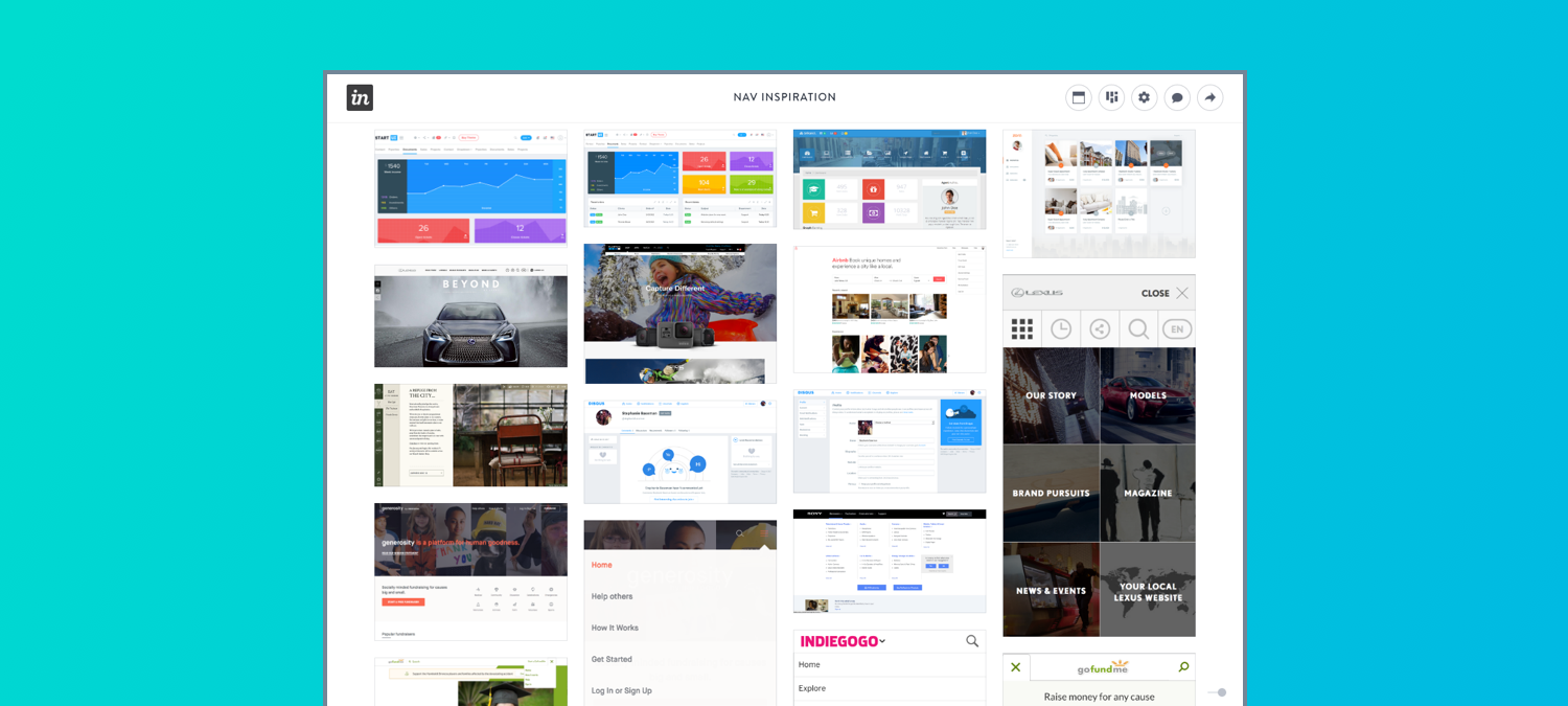
Inspiration Board & Brainstorm
What are competitors and other well-branded companies doing for their navigation, specifically responsive websites? YouCaring's navigation required three levels of navigation after authentication (global, profile, and fundraiser), so we sought out companies (in addition to our direct competitors) with a similar need to see how they were currently solving the problem.
We didn't want to take away from the user once they logged in, but we also wanted to allow them to focus in on what they wanted to do. We didn't want the navigation to feel clunky, bogged down with too many options, or vague in how to navigate through the site. And most importantly, we did not want to sacrifice our mobile experience just because the screen size is small. Looking at what others are doing allowed us to see things we might like to incorporate into our own navigation, as well as things we definitely did not want to do.


How can the ideas be represented? What needs to be created in order to test with users?
Variant 1 - Tabbed Structure
From our ideas, I designed a prototype where the global, profile and fundraiser navigation was available in a single hamburger menu dropdown with a tabbed structure along the top, separating the three levels of information. If the user had more than one fundraiser, they would need to navigate back to their profile and select the other fundraiser in order to activate/show the fundraiser level navigation. We liked that the navigation was all in one place, and the user wouldn't feel overwhelmed with a ton of options all at once. The concern with this navigation is the user would not notice the tabbed structure at the top for different levels of navigation.
Likes
• Navigation all in one place.
• User won't feel overwhelmed as each level has its own tab.
Concerns
• Users won't notice the tabbed structure.
• Not a common usability pattern.

Variant 2 - Single Panel
The second prototype I created was one where the global, profile and fundraiser level navigation was all in a single panel hamburger menu. The fundraiser level navigation could expand and close to simplify the space. We liked that the navigation was all in one place, but were concerned this one would feel overwhelming and unfocused.
Likes
• Navigation all in one place.
Concerns
• Users feeling overwhelmed by the options.
• Menu has a lack of focus.

Variant 3 (Iteration) - Separate Menus
From testing and listening to our users and identifying their pain points with initial two prototypes, we realized we may have been forcing the different levels of navigation all into one dropdown, thinking it would be more simple and intuitive; when in reality, users were left confused on where to go and how to switch to different fundraisers. We also noticed an issue of users not knowing where they were within the fundraiser or what fundraiser they were even managing.
Therefore, in this variant, we made the profile accessible at both the global and fundraiser level, which is where users would go to select a different fundraiser to manage. Also, once a user selects a fundraiser to manage, the fundraiser management pages are available to consistently at the top and note what page they are currently on.
Likes
• Notes what page the user is on within the fundraiser management area.
• Easily able to toggle between their fundraiser page and fundraiser management area.
• Consistency of the global navigation whether a user is logged in or logged out.
• Consistent orientation of what fundraiser the user is managing.
Concerns
• Two sets of navigation may feel disjointed and confusing to the user.
• User won't know which set of navigation to use for certain tasks.


What are users telling us that we can further iterate on? What went well? Where did users have difficulty?
Using UserTesting.com to test our prototypes, we started with two variants and tested them for the same indicators. with a primary focus on usability and note how easily a user completes the given tasks. The tasks given were set up in a way that required a user to navigate through each level of navigation from different areas of the site to test for intuitiveness. Although we were confident with Variant 2's performance with users who only have one fundraiser, it proved to hold some confusion for users with more than one fundraiser. Therefore, out from the pain points of Variant 2, we built a third and final prototype that clicked extremely well for both users with one or more fundraisers. Also, since managing more than one fundraiser requires more cognitive understanding, we started testing with that prototype first, iterated until we felt confident in its performance and then ran a few quick tests with users who only have one fundraiser. We originally started with users with one fundraiser because that is the vast majority of our user base.
User Testing Schedule
Test 1 - Round 1
Variant 1 (Single Fundraiser User) x 5
Variant 2 (Single Fundraiser User) x 5
Test 1 - Round 2
Variant 2 (Winner; Test for Multiple Fundraiser User) x 5
Test 2 - Round 1
Variant 3 (Test for Multiple Fundraiser User) x 5
Variant 3 (Iteration) x 5
Variant 3 (Iteration) x 5
Variant 3 (Test for Single Fundraiser User) x 5
"This website is extremely user friendly. I had no issues and I found it was so simple to navigate. I really wouldn’t change a thing at this point."
USER TEST SAMPLE
Final Test Summary
Variant 3 (Single Fundraiser Users)
• 5 out of 5 users could easily log in to their account.
• 5 out of 5 users could easily find the fundraiser navigation (to add a video).
• 5 out of 5 users could easily find their profile (and where to change their password).
• 5 out of 5 users could easily find where to log out of their account.
• 5 out of 5 users found how to get back into their fundraiser to add a photo.
• 5 out of 5 users could easily toggle between their fundraiser page and their fundraiser management area.
Variant 3 (Multiple Fundraiser Users)
5 out of 5 users found it very easy to log in.
5 out of 5 users found it very easy to add a photo to Fundraiser 1.
2 out of 5 users had slight difficulty switching to a different fundraiser, but once they figured it out, it was very easy for them to add a video to fundraiser 2.
1 user didn’t make the connection that “My Profile” is where she would find all her fundraisers.
5 out of 5 users found it very easy to log out.
4 out of 5 users said there was nothing confusing about the tasks given. The navigation was easy and intuitive.
1 out of 5 users described what was most confusing to her: “I think the most confusing was going back to find another fundraiser but I guess you get used to it because you click on your profile and your profile has all your fundraisers there.”


Specifications and Final Delivery to Engineering
IX Flow
(See example above.) Through trial and error, we found that IX Flows are tremendously helpful in communicating interaction flows to engineering. Our prototypes and supplemental specification documents always left room for developers to try to interpret what we wanted and left a lot of room for ambiguity. IX flows are wireflows that allow designers to document all new pieces of an interaction, no matter how big or small.
What are the benefits of IX Flows?
1. Centralizes the flow, visual design, and interactions in one document
2. Can be exported as a PDF, JPEG, etc. so this document can be viewed on any desktop
3. Reduces guesswork and ambiguity on the developer’s part
4. Reduces mistakes during development
Zeplin Project
IX Flows can be as detailed as what is required by your engineering team. It will take a couple sprints to find that sweet spot. If your team already has a design system up an running, the visual design details can be referred to by the appropriate code. Also helpful is uploading all new visual designs into Zeplin. This tool allows engineering to view the specific visual details of each element, as well as export any new illustrations or graphics.
Prototype
Prototypes allow you to share the experience with engineering and other shareholders, and most importantly, to test your ideas with users. However we found the IX Flows and Zeplin Project hand-off to be invaluable to engineers.