GOFUNDME
Redesign the fundraiser page template to new branding and improve key features and metrics.
PRIMARY GOAL
Refresh the design and address key pain points of the current page.
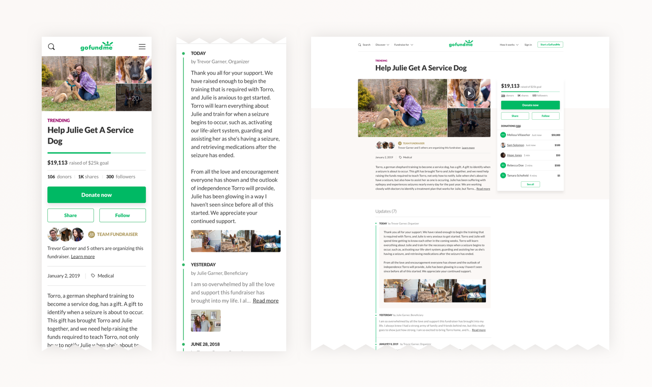
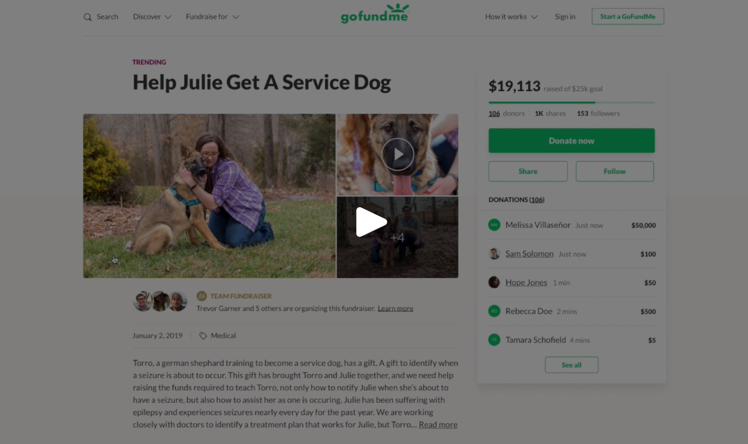
Desktop version of fundraiser page
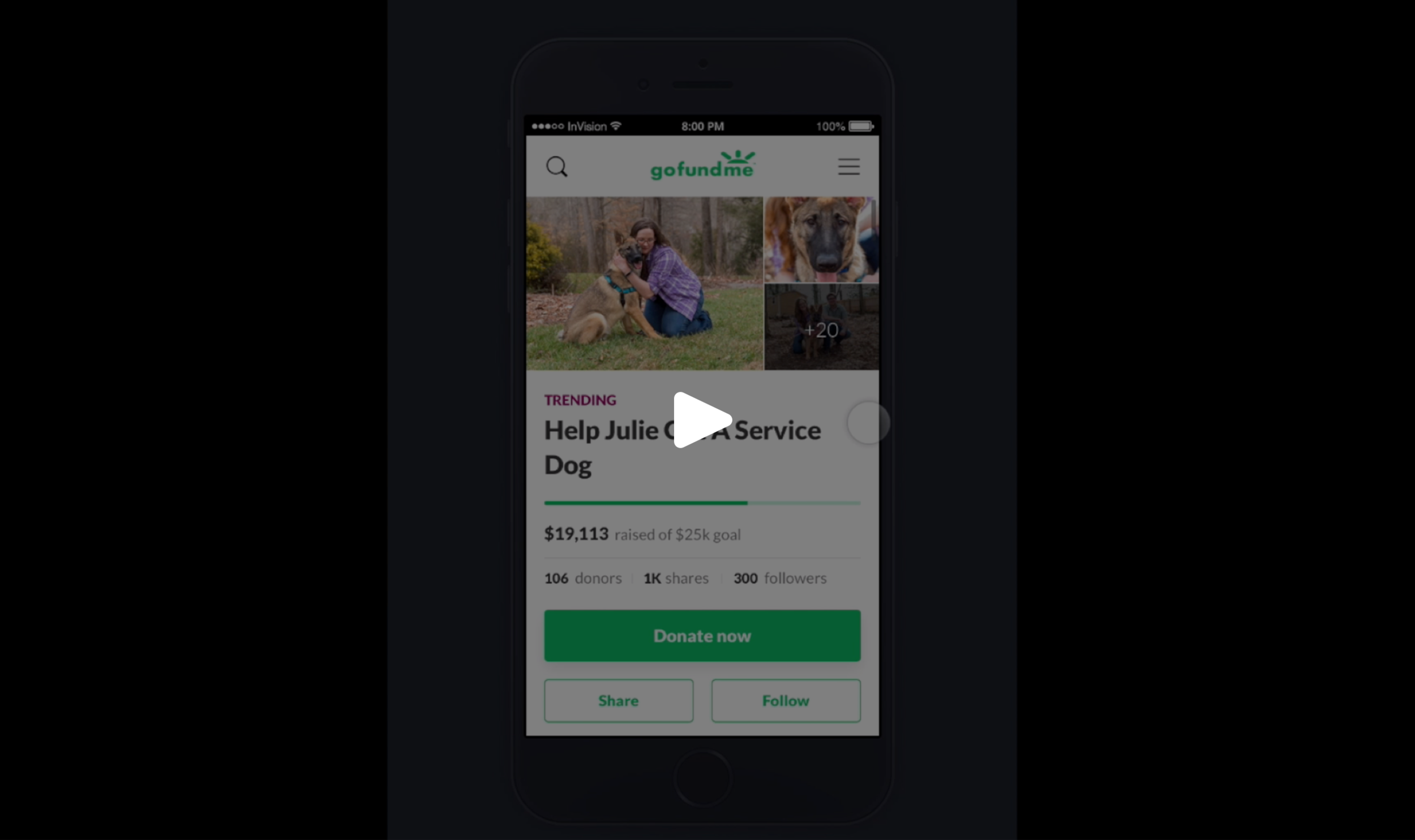
Mobile version of fundraiser page
MY ROLE
Lead product designer from prototyping, delivery of hi-fidelity assets and specifications to engineering, and design QA.
CONSTRAINTS
Mostly had to match current feature parity, and focus more on addressing pain points of the current presentation of information.


Who is the user? What matters to this person? How does this feature fit into their lives?
"Our seizure dog, Sophie, has given my daughter the independence she craves and me, the peace of mind to give her the space she needs to grow."
Hi, I’m Janae and I’m a stay-at-home mom, raising my daughter, Hera, who suffers with severe epilepsy. It started when she was 4, and we’ve spent the last 3 years finding ways to cope with her illness. It has been a very difficult and all-consuming road, but finding the right combination of medications and bringing Sophie into our lives has made all the difference. Sophie is a professionally trained seizure dog who has completely transformed my daughter’s life. Hera is more confident than ever and Sophie is a huge reason for that. Sophie warns her when she’s about to have a seizure and even helps her through them. She also alerts my husband and I when one is occurring, and Hera has been grateful for the freedom this allows.
I feel so lucky to have Sophie in our family as it is a rare gift few dogs have the capability of sensing. I also understand the cost of a seizure dog and what it takes to have them properly trained. I came across Julie’s fundraiser on my Facebook newsfeed as a cause I may want to contribute towards. Although I don’t know Julie, her story really resonates with me and what my daughter has had to endure. I would love nothing more than to give back and help someone in a similar situation get a seizure dog because I know how life-changing they can be.
Persona: “Stranger Donor”
Personal Information
• Age: 35 years old
• Occupation: Stay-at-home mother
• Location: Chicago, IL
• Household income: $200,000+
• Status: Married
Motivations
• Empathy of others coping with epilepsy
• Honoring her daughter
Goals
• Help Julie get and properly train Torro
Feature-Related Goals
• Donate to the fundraiser
• Learn about Julie and her story
• Evaluate that it’s a real fundraiser
• Learn what progress has been made
• Share the fundraiser with her community
• Follow the fundraiser’s progress
• Learn about who created the fundraiser for Julie and how they are related to each other

What are the problems this project attempts to solve? What do we want to achieve? How will we know if we're successful?
Point of View
(USER) Janae, an advocate of seizure dogs, (NEED) needs an easy way to learn about Julie’s story and situation to gather enough information to evaluate the validity and need of the fundraiser. (INSIGHT) Janae wants to help others like her daughter Hera experience the support of a seizure dog, because she knows the value and improvement in quality of life they can bring to an individual and family.
Goals
• Better user experience
• Establish credibility & trust
• Show social momentum and activity
• Improve usability of donor generated content viewer & updates
• Significantly decrease page load time
• Improve visual design; update to new style
• Donation conversion parity or better
• Increase user engagement outside of donation conversion (follow, share)
• Increase percentage of active fundraisers (fundraisers that have raised at least $5)
KPIs
• Decrease page load time
• Increase user engagement with the page
• Increase fundraiser follows
• Increase in sharing
• Increase percentage of active fundraisers
Current Pain Points
PAIN POINT #1
Up to 6-second page load time.
PAIN POINT #2
The “envelope” icon on the current page is not clear as a way to contact the organizer of the fundraiser.
PAIN POINT #3
Organizer and fundraiser verification is not present currently.
PAIN POINT #4
Inability to share individual updates of the fundraiser.
PAIN POINT #5
Current title placement gets lost and is buried
PAIN POINT #6
”Read more” link and “Read latest update” get confused on mobile because of their close proximity.
PAIN POINT #7
Updates section is often missed because it is hidden in a tabbed structure. Navigation between updates is heavy.
PAIN POINT #8
The subscribe “heart” icon on the current page is not clear as a way to follow the fundraiser.
PAIN POINT #9
Organization of information on the organizer, beneficiary and team is confusing.
PAIN POINT #10
The “+” button for other types of shares is confusing to users.
PAIN POINT #10
Most users did not notice the fact that there were more photos to view.
PAIN POINT #11
Donor generated content showed in the fundraiser images at the top, making users think the organizer added those photos.


What are the ideas? What are possible solutions?
Analysis Report
With the help of an UI / UX testing and marketing research firm, we were able to gain valuable insights in:
• identifying ethnographic donation habits and trends,
• understanding general usability of the fundraiser page,
• discovering what factors cause the target demographic to convert, and
• comprehending how to increase trust and credibility of fundraisers
Key Stakeholder Feedback
We identified and met with a number of cross functional teams, including leadership, communications, SEO, trust & safety, customer service, international/localized. The goals of these project kickoff meetings were to:
• socialize the start of the fundraiser page redesign
• understand the valued components of the current fundraiser page
• tap into opportunities and ideas cross functionally
• identify areas of weakness and pain points of the current fundraiser page
Competitive Analysis
We looked at several direct and indirect competitors to help with the ideation process, including:
• YouCaring
• Generosity
• Airbnb
• Kickstarter
• Crowdrise
• Facebook’s fundraiser feature
Design Team Brainstorm
The design team pulled together to ideate wireframes of some of the most important and complex components of the campaign page, including:
• the photo gallery
• the organizer, beneficiary and team information
• fundraiser updates


How can the ideas be represented? What needs to be created in order to test with users?
Rapid prototyping and ideation through divergent thinking
We initially used divergent thinking to prototype several approaches at the component level (photo gallery, organizer information, updates section, etc.), as well as, design how the information is organized on the overall page.
‘Divergent thinking is… a thought process or method used to generate creative ideas by exploring many possible solutions. It typically occurs in a spontaneous, free-flowing, ‘non-linear’ manner, such that many ideas are generated in an emergent cognitive fashion. Many possible solutions are explored in a short amount of time, and unexpected connections are drawn.’
Developing a prototype to test through convergent thinking
Then we leaned into our convergent thinking to arrive at a single prototype to user test.
‘Convergent thinking is… the type of thinking that focuses on coming up with the single, well-established answer to a problem. It often requires critical thinking and consciously using standards and probabilities to form judgements to arrive at a solution, which in may or may not be the ‘correct’ solution, which is why user testing is so important!

Image from UX Think

What are users telling us that we can further iterate on? What went well? Where did users have difficulty?
Using UserTesting.com to test for usability, I created a prototype of the experience, both on desktop and mobile, to test with four users each. Our main focus was addressing our key metrics and ensuring they are easy to find and use, as well as, evaluating if the page was quickly scannable of the information that meant the most to users. In summary, the page on both desktop and mobile performed very well. Users were easily and quickly able to grasp the story, as well as, understand the key actions of the page. Some additional valuable insights we gained:
• Half of users on mobile expected the donors stat at the top to be interactive
• Half of overall users expected if they were to follow the fundraiser, they would receive more information about the fundraiser than just a notification when a new update is posted (e.g., every time someone donates, when the goal is reached, when new comments are posted)
• There were strong misconceptions about what a “Fundraising team” means
• On desktop, evaluate the flexibility of the money box to ensure the “See all” button for donations is not hidden.
“In my opinion, the most important things I can do on this page are donate, share, and follow."
USER TEST SAMPLE

Specifications and Delivery to Engineering
Project Kick Off
Meet with all key stakeholders to review the project brief and demo the Invision prototype.
Orient engineering to where all the quick links are and run through all of the detailed requirements.
Answer any questions, address any concerns and take in any last minute feedback.
Invision Prototype
Due to the complexity of the page, I broke each section out into its own Invision project, which was helpful to bring focus to the engineers’ work based on the features and sections they were each assigned.
Project Brief in Confluence
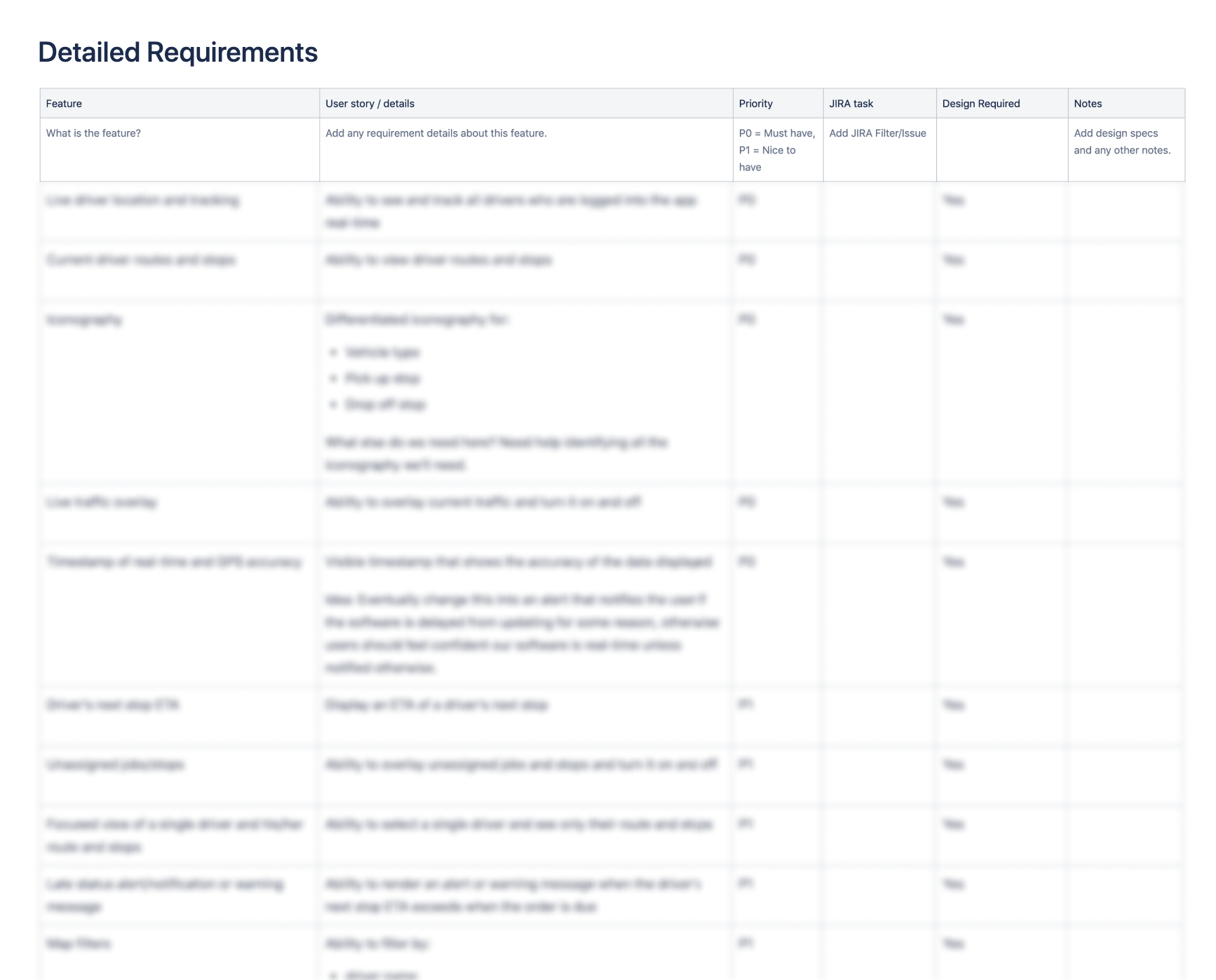
Alongside the PM, we created a project brief outlining various background on the project, including a section for design with a table of contents that linked out to the various Invision projects, as well as, detailed requirements for engineering. The detailed requirements were organized by feature with further details, including:
user story/feature details
priority
link to the JIRA task (which also allowed us to easily track the progress)
if there were any designs associated with the feature
if there were, we would add a link to those designs
any additional notes
Design QA and Launch
Join Scrums
One of the keys to a successful launch is collaborating with engineering at each step. Touching base during scrums is a great way for design to track progress, be available for questions, and provide an update on design QA progress.
Design QA
Documenting design QA feedback within JIRA as soon as features and/or requirements are ready for review helps fast track progress and getting to a final state, ready for launch.