
YOUCARING
Create a management portal for users who want to manage their online fundraiser.
PRIMARY GOAL
Design a new management portal that is intuitive and easy-to-use on all device sizes and address each user as an individual with a new profile structure and a key focus on helping the user create successful fundraisers.
MY ROLE
Lead product designer and manager from initial research and ideation to prototyping and the final delivery of hi-fidelity assets and specifications to engineering.
CONSTRAINTS
• Must adapt to any screen size.
• For MVP and initial launch, must stick with existing functionality, but build with future growth in mind.


Who is the user? What matters to this person? How does this feature fit into their lives?
"I'm trying to stay strong and positive for my daughter, but deep down I'm terrified and we need help."
Hi, I’m Tara and I’m raising money for my 3 year old daughter, Charlotte who was recently diagnosed with cancer. I'm distraught, scared and can't stand the sight of my daughter in a hospital bed in deep pain. As much as I can't even think about the money her treatments are costing, I know it's not going to go away and they are only going to continue to mound. They are just starting to come in and they are astronomical and overwhelming.
So many of our friends, family and members of our community have asked for ways they can help and support us, and I never know what to tell them. A friend of mine told me I should set up a YouCaring fundraiser so people can help financially and stay up-to-date on Charlotte’s progress. From my phone, I set up a fundraiser while at the hospital with my daughter. Now that it’s set up, I need an easy way to manage the fundraiser, primarily from my phone since I’m not near a computer much these days.
Personal Information
• Age: 35 years old
• Occupation: Nurse
• Location: Chicago, IL
• Income: $80,000–$100,000
• Status: Married
Motivations
• The love for her daughter
• Fear of debt
Goals
• Raise as much money as possible
• Feel emotional support from her community
Feature-Related Goals
• Edit their fundraiser
• Share their fundraiser
• Post new content (videos, updates, etc.)
• Share an update
• Withdraw their donations
• View their donations
• View their fundraiser
• Delete their fundraiser
• Thank Donors

What are the problems this project attempts to solve? What do we want to achieve? How will we know if we're successful?
Point of View
(USER) Tara, a mother of a 3 year old with cancer, (NEED) needs an easy way to manage her YouCaring fundraiser from her phone, while she's with her daughter in the hospital, or on her computer when she's at home. (INSIGHT) Tara wants to add and edit content, view changes she's made, share updates with her community, and view and manage donations, and thank her donors for contributing.
Goals
1. An effective information architecture that makes things easy to find and is intuitive to use.
2. A simplified, consistent and responsive design that allows for expansion and growth.
3. Prioritization of key actions holistically in the UI.
4. An account that is profile-centered, housing their fundraisers, donations, community and personal settings. (We focus on the person behind the fundraiser(s) and/or donation(s) first.)
5. A voice that is easy to understand, actionable and brand-aligned.
6. A platform that provides guidance on our top tips/recommendations built directly into the UI.
7. Get new non-specific/donor user accounts to start fundraisers, become an organizer (create at least 1 fundraiser).
8. A greater sense of community, engagement and support between our users.
KPIs
• Increase in fundraiser activation rate (raised $1)
• Increase in share volume per fundraiser
• Increase in updates made per fundraiser
• Increase in user contributed content (longer stories, more photos/videos, etc.)
• Higher NPS scores
• Fewer fundraiser management related tickets to CS
• Implementation of new growth opportunities/channels:
• Enable nonspecific user accounts (the ability for users to create a YouCaring account, but have not yet made a donation or started a fundraiser)
• Increase in new community engagement (follows, hearts, groups, etc.)
Current Pain Points
PAIN POINT #1:
CS's Top Manage-Related Tickets
• Needs help setting up payment provider
• Can’t figure out how to cancel/delete their account/fundraiser
• Inquiries about fundraiser best practices at being successful
• Payment processor management (change processor, paypal verification, confusion around withdrawing donations)
• Perception that Facebook is the only place they can upload images from, since that's the default option and left panel tabs are missed.
• Confusion when uploading photos (just showing file name, no progress bar or image preview while it’s uploading)
• Cropping options, image manipulation (more of an issue in fundraiser creation)
PAIN POINT #2
Needs help getting started after fundraiser creation (clear action steps, onboarding stream).
PAIN POINT #3:
Current Manage Pain Points
• We couldn't continue to grow in important ways due to the current backend framework the site was built upon.
• Insufficient, ambiguous, cryptic messaging, especially on alerts/errors (unable to self-serve).
• Resolve caching issue: when a user takes an action, our alerts need to reflect that action (e.g. We ask them to add a bank account, they do, however our messaging still tells them to add a bank account).
• When the user is viewing their fundraiser donation page, they no longer have access to their fundraiser navigation and have to go back through the global navigation first.
• Inconsistent design (color, text, font styles, button treatments, etc.)
• Not optimized for mobile use (e.g. Editing FR details)
• Too many buttons
• Key actions buried in tabbed structure


What are the ideas? What are possible solutions?
Competitor Analysis
I conducted a Competitor Analysis Workshop with key stakeholders in the company to identify the strengths, weaknesses and areas of inspiration of four of our competitors or other services that have a similar framework, including Generosity, GoFundMe, LinkedIn, TILT, Indiegogo and Classy.
Brainstorm
What are competitors and other well-branded companies doing for their management portals, specifically responsive websites? An MVP of YouCaring's management portal required a personal profile section (private to only themselves), an area to manage any fundraisers they created, and view what the public facing page looked like. Therefore, we sought out companies (in addition to our direct competitors) with a similar need to see how they were currently solving the problem.
What ideas do we have for the fundraiser management portal? How do we envision YouCaring in the future? What features are core to our business, and what features can help us grow to the next level?
At an annual culture summit, we collected ideas from all over the company, asking what should the future of YouCaring look like? We also collected ideas through reflecting on and discussing pain points and feature requests that funneled through Customer Service. Finally, we brainstormed with the internal product team and for any promising or potential idea, we asked the question, can our Information Architecture hold up to it?
Information Architecture
From our competitor analysis, brainstorm, and future features ideation, we continued to iterate on a functional, intuitive information architecture. This allowed us to envision the future of YouCaring, see how all the pieces will fit together, and build a product flexible enough for growth and change. By prototyping an MVP with a mindset of growth, we are more likely to build a platform that can expand, change and be flexible.


How can the ideas be represented? What needs to be created in order to test with users?
Wireframes
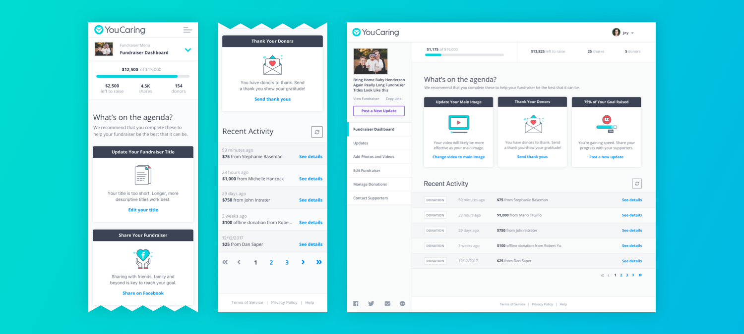
Initially we started with rough wireframes and explored different layout options across different devices. On desktop, we tried a horizontal navigation along the top with different sub navigation treatments, as well as varying options of a left navigation. For mobile, we tried treatments that look more app-like, as well as a navigation that slides up from the bottom and a more traditional option of a full-screen hamburger menu dropdown.
Once we decided on moving forward with a left navigation style due to the latest trends, usability and future growth and expansion of our product, we started to create prototypes with more details to prepare for user testing.
Low Fidelity Prototype
The primary purpose of the lo-fi prototype was to determine its usability and functionality. When a user is asked where they would go to complete certain tasks, do they navigate to the correct places (or the places where we assumed they would expect to go)? We developed the prototypes to a level high enough that someone could feel it's something they could interact with, but didn't pay too much mind to consistency, detail or color.


What are users telling us that we can further iterate on? What went well? Where did users have difficulty?
As we refined the low fidelity prototypes based on user feedback and became more confident in their function and usability, we began developing higher fidelity mocks, as well as, building out the more intricate, detailed experiences within the fundraiser management portal. Experiences like sharing on social, writing and posting new updates, uploading new photos and videos, thanking donors, etc.
Throughout the process, we looped in engineering so they could begin some of the work required on the backend, and we continued to iterate on the user experience and visual design. Once users were getting through the tasks seamlessly, and we built a consistent, new style guide and framework for the fundraiser management portal, I prepared a final prototype and specification document for engineering, as well as all of the new components of the new design.

Specifications and Delivery to Engineering
Project Kick Off
Meet with all key stakeholders to review the project brief and demo the Invision prototype.
Orient engineering to where all the quick links are and run through all of the detailed requirements.
Answer any questions, address any concerns and take in any last minute feedback.
Invision Prototype
Due to the complexity of the project, I broke each page out into its own Invision project, which was helpful to bring focus to the engineers’ work based on the tabs and respective features they were each assigned.
Design QA and Launch
Join Scrums
One of the keys to a successful launch is collaborating with engineering at each step. Touching base during scrums is a great way for design to track progress, be available for questions, and provide an update on design QA progress.
Design QA
Documenting design QA feedback within JIRA as soon as features and/or requirements are ready for review helps fast track progress and getting to a final state, ready for launch.